andrewlee.hufton
Exploring the international sharing of genetic sequence across time
On a recent rainy Sunday, I finally finished a little code project I have been working on for the last several months: creating animated time-lapse charts in ChartJS. There are better frameworks for this, but I like the simplicity of ChartJS and wanted to see how far I could push it given my rudimentary Javascript skills.
The test case I have been using is a neat chart I encountered while working in 2021 and 2022 in the science policy team at the DSMZ. It was created by some of my ex-colleagues in the WiLDSI project.
As a bit of background, the project is studying and developing science-based guidance on the sharing of benefits associated with digital sequence information (DSI). This thorny issue has been threatening to derail major international biodiversity agreements and researchers have been worried that an inelegant solution could undermine the culture of open data sharing that has characterized much of modern genetic research. Some progress was made in December, when Parties to the Convention on Biological Diversity met in Montreal and adopted a landmark action plan, the Global Biodiversity Framework, which includes an agreement to build a multilateral benefit-sharing system for DSI that will protect open science. This is a first step rather a solution. The Global Biodiversity Framework is not binding and many important details remain to be negotiated.
In their work on this issue, researchers in the WiLDSI project have used open data and quantitative methods to study how DSI are used and shared around the globe. You can read about their work and data in a pair of papers published in 2021 (Lange et al. 2021; Scholz et al. 2021). One particular graph they developed stayed with me because it provides a compelling visualization of the global interdependence of DSI research (see Figure 5 in Scholz et al).
Below is a version I have created from the WiLDSI team’s raw data, but using some custom code of my own to boost the amount of DSI use and provision that is captured in the chart (see Methods).
In this chart, public data sources are used to calculate two values for each country: the number of countries from which its researchers are using DSI and the numbers of countries to which that country is providing DSI. ‘Providing’ here is a passive concept, taken to mean simply that DSI that originated from an organism in one country has been used elsewhere. These numbers can be taken as rough proxies, respectively, for how developed a country’s DSI research enterprise is (based on the assumption that a larger research enterprise will use DSI from a greater diversity of sources) and for how much academic value is being taken from the DSI originating in that country. With this we can look at the global balance between provision and use of data – between ‘taking’ and ‘giving’ – at least within the academic research sphere.
Countries are spread from the bottom left (using from and sharing with only few countries) to the top right (using from and sharing with many countries). Economic disparities are evident. Developing nations (G77) tend to be in the bottom left and developed nations (OECD) tend to be in the upper right. The rapidly developing BRICS nations lie close to the developed nations. Almost all nations show evidence of both using and providing DSI, and there is a strong correlation between providing and using DSI. This supports a common researcher viewpoint that essentially all biology researchers use and benefit from public DSI. It also can be seen to contradict a narrative commonly evoked in policy discussions that biodiverse “provider” nations are losing out on benefits that are mostly reaped by wealthy “user” nations. We do not see a divide into providers and users, but a gradient from low use & provision to high use & provision. If we dive deeper into the data, however, we can see that both points-of-view reveal themselves, under the right visualizations.
On closer inspection, one can see that the trend is in fact somewhat S-shaped, with developing countries in the bottom right falling more on the “provider” side of the graph and developed nations falling more on the “user” side (activate the “Parity” line in the graph above to see this more clearly).
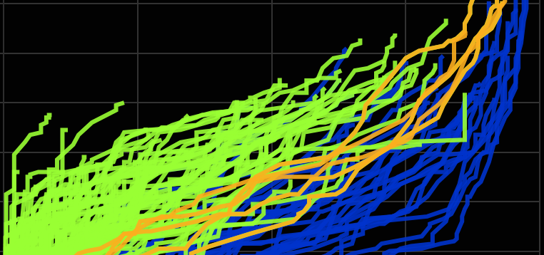
The graph above shows the cumulative history of DSI use and provision at a specific point in time: July 2022. Using the same dataset, we can explore how each nation’s DSI use and provision changed over time (see below). A new picture emerges. Now there is a much clearer separation between developing and developed nations. There is clearly a difference in the histories that these countries have experienced. Developing nations spend much more time on the provider side of the chart, even if they end up, in the end, on the user side. Interestingly, the rapidly developing BRICS nations seem to travel right up the middle.
We can go still further and chart the difference of each countries’ values to the idealized case of perfectly equal provision and use (i.e. we can plot the residual values from the parity line). The diversity of use and provision patterns becomes even more apparent, particularly within the G77 countries. Within this group, however, there are a number that shifted dramatically from the provider side to the user side in the last decade. A similar shift is seen across the BRICS nations about a decade earlier.
Stepping back for a moment from these specific data, the chart above exposes a limitation of ChartJS. The animation of each subsequent dataset is slightly delayed. On my test computer, BRICS countries, which are animated first, run about five years ahead of the OECD countries, which are animated last. This is a known bug. So, in the end, we are only roughly simulating a time-lapse. Oh well.
As a final visualization, we can show the average residuals for each economic group. The BRICS countries’ shift from providers to users remains quite apparent. For the G77 nations, we see that the overall average for the group is actually close to the parity line, despite the diversity of histories in this group.
In the end, by looking at the data in different ways, we can better see and understand different viewpoints. When we look at the histories of DSI use, there is a divide between provider and user nations, with economically developing nations spending more time as providers. At the same time, the researcher view, which stresses the importance of global DSI sharing, is equally present in the data. Use and provision are correlated and countries that have developed rapidly have also shifted rapidly to the user side of the chart, presumably as their research enterprises grew and became increasingly dependent on DSI from other nations.
This helps explain why researchers from around the world, including from developing nations, have been fighting to protect open DSI sharing while also stressing the need for an economically meaningful benefit sharing solution. Policy solutions that inhibit open data sharing could, in effect, risk trapping developing nations on the provider side of the chart, by making it harder for them to access and use DSI from other nations.
To learn more about researcher views on this topic, visit the DSI Scientific Network website. The DSI Network, of which I am a member, is a grassroots researcher-led group speaking out for sensible policies on DSI.
From a data visualization point-of-view, I think this emphasizes the value of taking into account temporal changes not just final outputs, especially when looking at issues of historical equity or justice.
As for ChartJS, I think these charts look good, but if I were to create similar charts again, I would probably start out with a different framework that has more explicit support for time-lapse animations, such as plotly.
Methods
Data on DSI generation and use were downloaded from the WiLDSI Data Portal. I used the data freeze from 15 August 2022 (archived here). For details on these data, please see the WiLDSI Data Portal and the prior publications from this group (Lange et al. 2021; Scholz et al. 2021).
Custom Perl scripts were then used to count provision and use numbers for each country, and to generate ChartJS figures. All code is available at GitHub.
Country name mappings were performed with a version of the WiLDSI Project’s default mapping table, with some minor additions that helped capture more use and provision cases. See the GitHub repository for details.
The country of origin information for each sequence is derived from information provided by the host sequence repository. Country-of-use is derived from the affiliations of authors listed on publications citing sequences in the public databases. Both ‘primary’ and ‘secondary’ publications are used (see the WiLDSI Data Portal for information on these two different publication types). Affiliations from all authors are considered. As such, a single publication can indicate use from multiple countries.
The final numbers consider only the number of countries with which a country is sharing or providing DSI. Whether a country is using one sequence or thousands from another country doesn’t matter.
The numbers presented here are higher than the numbers shown in the 2021 publication by Scholz et al. because I am using a more recent WiLDSI dataset, have included all authors and I have added some additional country name mappings. My code also tries to include all possible primary and secondary publications (and is very slow as a result), which may result in some further numerical variations.
The charts shown here use ChartJS version 3.1.1. Thanks to the ChartJS-tutorials YouTube channel, which helped me understand some of the vagaries of creating interactive charts with ChartJS.

This work is licensed under a Creative Commons Attribution 4.0 International License.