Generating journal citation distributions from open data
The journal impact factor (JIF) and other citation-based journal metrics still have a strong hold on researchers and journal editors, despite being widely criticized. One of the main criticisms is that the underlying distributions are too skewed and overlapping for these numbers to provide any statistically meaningful information about the impact of individual pieces of research. In 2016, a group of influential researchers and editors proposed that showing journal citation distributions could “help to refocus attention on individual pieces of work and counter the inappropriate usage of JIFs” (Larivière et al). Clarivate, the provider of the JIF, as well as a number of journals, now show citation distributions on their websites (see e.g. Clarivate, Journal of Cheminformatics, Nature Portfolio, Science journals).
I think this is a positive move, but I am often dissatisfied with how these distributions are visualized. Histograms, in particular, are not ideal for viewing skewed distributions and can be difficult to cross-compare. In addition, distributions often rely on Clarivate’s Web of Science database, which requires a subscription to access and has been criticized for being opaque. The Initiative for Open Citations (I4OC), whose founders include some of the authors of Larivière et al, is advocating for open release of citation data. Several publishers have already signed on, but fully open citation data are still rather sparse (explore at OpenCitations.net).
CrossRef, however, already provides bulk citation counts through its public API, derived from both open and non-open citation information submitted to their databases (Hendricks et al 2020). These bulk data have limitations: one cannot view citations from a specific time period, filter out specific publications types or explore the identities of the actual citing papers. But, they are sufficient to allow us to explore different visualization techniques. All the graphs shown below were generated based on CrossRef data for publications in 2017 and 2018, which is roughly comparable to the period used to calculate the 2019 JIFs.
Let’s look first at the histogram. To ensure cross-comparability, I have used a bin-width of one and have normalized the frequencies as a proportion of each journal’s total content.
We face an immediate problem: if we include the whole tail we compress the rest of the distribution into oblivion. Larivière et al and Clarivate solve this by showing all publications with citations above a cutoff as a single bar at the end of the histogram.
It’s a sensible solution, but it requires an arbitrary decision about where to place the cutoff. And, notice how much of the distribution we need to cut off in order to see anything useful.
Another solution is simply to display the distribution in logarithmic space. Zero values can’t be plotted in log space, but I’ve included them on an arbitrarily placed x=0 axis for completeness. This is sometimes called a “symmetric log” or “symlog” scale (see this blog for more).
With either option, more of the detail in the distributions in apparent, but can you tell which distributions are the most similar? I’ll give you a hint: two journals have distributions that are statistically indistinguishable (Kolmogorov-Smirnov test, alpha = 0.05). If it isn’t immediately clear, try comparing the journals two-at-a-time by clicking on the journal names.
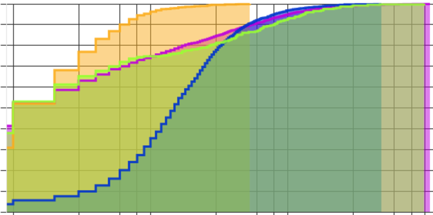
Another visualization method that is commonly used in statistics to compare distributions is the empirical cumulative distribution function (eCDF). Here, each point represents the proportion of publications (y) that have x or fewer citations.
The eCDF has some clear advantages. It smooths out noisy distributions and the median value is easy to identify (the x value at y = 0.5). It is also closely related mathematically to the Kolmogorov-Smirnov test. The more space you can see between the distributions, the more likely they are to be statistically distinct. With this visualization, it is also easier to discern differences in the tails, especially in this example between about 30 and 200 citations per publication, where we get very little visual information from the histogram.
If we take the inverse of the eCDF, we retain these advantages but produce a visualization that might seem more familiar. Clinicians, in particular, may recognize this from Kaplan-Meier survival curves. You get a tail stretching out to the right, which just ‘feels’ right for skewed distributions like these. Stuart Cantrill used a similar visualization to compare chemistry journal citation distributions in his 2015 blog. Here’s our four test journals again with this option:
With either of the eCDF visualizations, it is strikingly clear which two journals have similar distributions: JAMA and Nature Reviews Endocrinology. Interestingly, the 2019 JIFs of these two journals are more than fifteen points apart (2-yr 2019 JIFs: JAMA 46, Nat Rev Endocrinol 29). This is a vivid example of how Clarivate’s content categorization affects the JIF. Only papers Clarivate categorizes as “citable” count in the JIF denominator, while citations accrued by all content, “citable” or not, count in the JIF numerator. Both journals benefit from this process, but JAMA benefits more. Only 13% of JAMA‘s content is categorized as citable compared to 23% of Nat Rev Endo during this period. And, “non-citable” items do get cited. 72% of JAMA articles with at least one citation in the 2019 JIF period are categorized as “non-citable”. If you filter these papers out, you are hiding a big part of the citation distribution.
You can explore these four journals, along with other visualization options, in the full webtool report.
It’s also not hard to find journals that have similar JIFs but distinct citation distributions. Below are distributions for four journal’s that all had 2019 JIFs in the elevens (webtool report). Nucleic Acids Research and Molecular Biology and Evolution have comparatively ‘heavy’ tails of high-citing outliers. Annual Reviews in Biophysics, in contrast, has a distribution that is much more centered around its median of about 39 citations per paper.
My point, which I hope the examples above illustrate, is that it is possible to visualize citation distributions in ways that make them appear more uniform than they really are. This risks concealing the real diversity of these distributions, which itself is one important reason to be suspicious of journal impact metrics. Comparing distributions with different shapes using a single metric is just plain statistical nonsense. Of course, there are plenty of other reasons why journal impact metrics are statistically flawed. See the Further Reading section, below, if you still need convincing.
Even with good visualization, it can be difficult to determine if differences are meaningful when data are sparse. The Econometrics Journal (2019 JIF: 2), for example, only publishes about 25 papers a year. The resulting citation distribution is sufficiently data-sparse that it cannot be declared significantly different from ZooKeys (2019 JIF: 1), Nature Astronomy (2019 JIF: 11) or Nature Reviews Endocrinology (2019 JIF: 29). View the webtool report.
If we aim to use distributions as any part of a campaign to counter the inappropriate use of JIFs, I would argue we should:
- Show the whole distribution, not just subsets of content
- Use visualizations that maximize the ability of the viewer to see differences
- Use open data sources, whenever possible, to reduce dependency on the companies that have a commercial interest in promoting flawed journal impact metrics in the first place
- Apply some basic statistical rigor, by showing statistical tests or confidential intervals when making comparisons
For those that want to make their own citation distributions, all the graphs shown here were generated with open source code available at GitHub, using data provided by CrossRef’s public REST API. A live webtool version is available here.
Educating people about the statistical flaws inherent to impact metrics is, in some ways, a first step. It is far from clear that citations are even a relevant proxy for scientific value, regardless of the metric used. More fundamentally, over-reliance on any metric can incentivize gaming the metric instead of producing quality science (see Goodhart’s Law).
Positively, many organizations and institutions are reforming their evaluation systems to better reflect shared scientific values like quality, innovation, collaboration, openness and inclusion. The signatories to the Declaration on Research Assessment (DORA) have been leaders in this movement, and the DORA website shares a number of compelling case studies.
Acknowledgements
Thanks to Brian Cusack and Anke Sparmann for helpful feedback.
Further Reading
- Biagilo, M. Watch out for cheats in citation game. Nature535, 201 https://doi.org/10.1038/535201a (2016)
- The author discusses Goodhart’s law and prevalent forms of citation fraud.
- Callaway, E. Beat it, impact factor! Publishing elite turns against controversial metric. Nature 535, 210–211, https://doi.org/10.1038/nature.2016.20224 (2016)
- Curry, S. Sick of Impact Factors. Occam’s Typewriterhttp://occamstypewriter.org/scurry/2012/08/13/sick-of-impact-factors/ (2012)
- A compelling, and pleasingly polemic, summary of the statistical flaws with the JIF.
- Garfield, E. The Agony and the Ecstasy— The History and Meaning of the Journal Impact Factor. International Congress on Peer Review And Biomedical Publication http://garfield.library.upenn.edu/papers/jifchicago2005.pdf (Chicago, 2005)
- A history of the journal impact factor, as told by one of its inventors, Eugene Garfield.
- Hendricks, G., Tkaczyk, D., Lin, J. and P. Feeney. Crossref: The sustainable source of community-owned scholarly metadata. Quantitative Science Studies 1, 414–427, https://doi.org/10.1162/qss_a_00022 (2020)
- Larivière, V. et al. A simple proposal for the publication of journal citation distributions. Preprint available at BioRxiv https://doi.org/10.1101/062109 (2016)
- See refs. 2-13 in this paper for more background on the statistical criticisms of the JIF.
- Norden, R. Controversial impact factor gets a heavyweight rival. Nature 540, 325–326 https://doi.org/10.1038/nature.2016.21131 (2016)
- Wang, J., Thijs, B., and W. Glänzel. Interdisciplinarity and Impact: Distinct Effects of Variety, Balance, and Disparity. PLoS ONE10, e0127298, https://doi.org/10.1371/journal.pone.0127298 (2015)
- Interdisciplinary works can be disadvantaged by short-term citation metrics

This work is licensed under a Creative Commons Attribution 4.0 International License.

Andrew L. Hufton, PhD
Scientific editor, open science advocate
 https://orcid.org/0000-0002-2003-9573
I am the Editor-in-Chief Patterns, a data science journal from Cell Press. Check out my about me page and my CV to learn more about my career and professional interests.